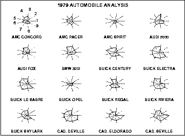
The star plot consists of a sequence of equi-angular spokes, called radii, with each spoke representing one of the variables. The data length of a spoke is proportional to the magnitude of the variable for the data point relative to the maximum magnitude of the variable across all data points. A line is drawn connecting the data values for each spoke. This gives the plot a star-like appearance and the origin of the name of this plot.
The star plot is a method of displaying multivariate data. Each star represents a single observation. Typically, star plots are generated in a multi-plot format with many stars on each page and each star representing one observation.
Star plots are used to examine the relative values for a single data point (e.g., point 3 is large for variables 2 and 4, small for variables 1, 3, 5, and 6) and to locate similar points or dissimilar points.
In diagram: The plot abve contains the star plots of 16 cars. The data file actually contains 74 cars, but we restrict the plot to what can reasonably be shown on one page. The variable list for the sample star plot is 1=Price, 2=Mileage (MPG), 3=1978 Repair Record (1 = Worst, 5 = Best), 4= 1977 Repair Record (1 = Worst, 5 = Best), 5=Headroom, 6= Rear Seat Room, 7=Trunk Space, 8= weight, and 9= Length
Wednesday, July 30, 2008
Stem and Leaf Plot
A Stem and Leaf Plot resembles a histogram turned on its side. It shows the shape and distribution of values in data sets. The value written in first in the row is referred to as the stem and the number following that value are referred to as the leaves. For instance, the first value is 55; the next value is three then the total distribution of the values would be 553. Simply take the stem and add it to the leaf. Another example, the number 38 would be stem: 3 and Leaf: 8.
Box Plot
A boxplot is a way of summarizing a set of data measured on an interval scale. It is often used in exploratory data analysis. It is a type of graph which is used to show the shape of the distribution, its central value, and variability. The picture produced consists of the most extreme values in the data set (maximum and minimum values), the lower and upper quartiles, and the median.
(Definition taken from Valerie J. Easton and John H. McColl's Statistics Glossary v1.1)
Parallel Coordinate Plot
A Parallel Coordiante Plot: A methodology for visualizing analytic and synthetic geometry in RN is presented. It is based on a system of parallel coordinates which induces a nonprojective mapping between N-dimensional and two-dimensional sets. Hypersurfaces are represented by their planar images which have some geometrical properties analogous to the properties of the hypersurface that they represent. A point ← → line duality when N=2 generalizes to lines and hyperplanes enabling the representation of polyhedra in R N. The representation of a class of convex and non-convex hypersurfaces is discussed, together with an algorithm for constructing and displaying any interior point. The display shows some local properties of the hypersurface and provides information on the point's proximity to the boundary.
- Parallel coordinates: a tool for visualizing multi-dimensionalgeometry;
Inselberg, A.; Dimsdale, B.
- Parallel coordinates: a tool for visualizing multi-dimensionalgeometry;
Inselberg, A.; Dimsdale, B.
Triangular Plot
A Triangular Plot incorporates a variable with three different characteristics. When looking at a triangle, if one were to go towards a certain peak or characteristic, then the point would contain less characteristics of the other two. Perfect harmony of the three characteristics lies within the dead center of the triangle. Here is where the variable contains equal portions of all three characteristics.
Windrose
A Windrose is a depiction of wind speed and direction dispersed throughout a certain area or region. In the center of the Windrose, is the default starting point and as you go away from the center, the bands are different values of frequency.
Climograph
A Climograph is a graphical depiction of the monthly precipitation and temperature conditions for a given area. Precipitation is shown by a bar graph, while a line graph depicts temperature.
Index value plot
Index Value Plot is an illustration viewing values and recording them against time to show fluctuations or change in the variable.
Lorenz Curve
Lorenz Curve (s) illustrates variables based on a line of equality and inequality. The Lorenz curve is a line of inequality based on probability distribution. The Lorenz curve is then referenced to the line of equality to establish patterns. The further the Lorenz curve lies below the line of equality, exhibits a more unequal distribution of values.
Bilateral Graph
A Bilateral Graph displays variables with positive and negative values. There is a static value then becomes the base for the neutral value. Any values with a positive integer is shown proceeding above the neutral line. Any value with a negative integer is shown leading away below the neutral line.
The graph shown, illustrates the same variable on a bilateral graph for two classifications (Overall % change and % change in US$m)
Nominal Area Choropleth Map
Nominal Area Choropleth maps are derived from qualitative data that is ranked, but without the ability to be measured.
Unstandardized Choropleth Maps
Unstandardized Choropleth Maps contain values taht are made up of raw data; the data has not been modified to become standardized. By using raw data, unstandardized values, this can illustrate comparisons between different areas that might not be found using different forms of choropleth maps.
This is a unstandardized choropleth map created in 1867 by Henry Mayhew of Criminals in the county of England and Wales
Standardized Choropleth Maps
Standardized choropleth maps use a standardize data entry that allows values to be simplified to allow easy comparisons between two or more places or areas.
Univariate Choropleth Map
A Univariate Choropleth Map is based on a single variable as opposed to a bivariate map containing two variables.
Bivariate Choropleth Maps
In conventional cartography, the term "bivariate maps" specifically refers to bivariate choropleth maps that display two variables using graduated color symbols. The gradient colors of the map, legend, are corresponding to variables on the map.
Unclassed Choropleth Map
Classed Choropleth Map
Classed Choropleth maps are based on data where the values are graded by density and height to create a shading gradient. The means to fulfill a classed choropleth map involves finding a frequency curve by using a frequency histogram. Once there are patterns established a shading graident is applied to each of the classes making the map areas become a certain color to the corresponding frequency class.
Monday, July 28, 2008
Range Graded Proportionate Circle Map
Range Graded Proportional Circle Maps are illustrations based on using circle size to represent values set in a given range. These ranges are based on elements of breaks when deriving data.
Continuously Variable Proportional Circle Map
DOQQ - Digital Ortho Quarter Quads
A digital orthophoto quadrangle (DOQ) is a computer-generated image of an aerial photograph in which image displacement caused by terrain relief and camera tilts has been removed. It combines the image characteristics of a photograph with the geometric qualities of a map.
DEM - Digital Elevation Model
DLG - Digital Line Graph
The U.S. Geological Survey's (USGS) digital line graph (DLG) files are digital vector representations of cartographic information. Data files of topographic and planimetric map features are derived from either aerial photographs or from cartographic source materials using manual and automated digitizing methods.
DRG - Digital Raster Graphic
A digital raster graphic (DRG) is a scanned image of a U.S. Geological Survey (USGS) standard series topographic map, including all map collar information. The image inside the map neatline is georeferenced to the surface of the earth and fit to the Universal Transverse Mercator projection. The horizontal positional accuracy and datum of the DRG matches the accuracy and datum of the source map. The map is scanned at a minimum resolution of 250 dots per inch.
Isopach
A line drawn on a map through points of equal true thickness of a varified stratigraphic unit or group of stratigraphic units.
Isopleth
Isotach
Isobars
An Isobar map illustrates an isoline image that represents points that have constant amounts of pressure, represented in millibars of pressure.
Doppler Radar
Black and White Aerial Photo
The Columbia Encyclopedia, Sixth Edition Date: 2008:
Aerial and satellite photography technology and science of taking still or moving-picture photographs from a camera mounted on a balloon, airplane, satellite, rocket, or spacecraft. In the 19th cent., photographers such as Thaddeus Lowe and George R. Lawrence took impressive pictures with cameras suspended in hot-air balloons or hung from kites, demonstrating both the scenic and military value of aerial photography. With the development of aviation, photogrammetry (the science of making measurements and maps from photographs) became an important tool. During World War I and subsequent conflicts, aerial photographs provided vital intelligence. Military aerial photography has now advanced to the point that the rank of a foot soldier can be determined from photographs taken from high-flying planes and satellites. Because of its military importance, much of the most sophisticated surveillance technology remains classified.
Infrared Aerial Photo
Infrared film and infrared digital sensors are sensitive to a certain portion of the spectrum of light, and by careful filtration, processing and selection of films, infrared aerials can provide invaluable information.
Most infrared aerial documentation involves the creation of vertical infrared aerials. Combined with orthorecitification techiques, comprehensive infrared aerial maps can be created which can be invaluable both for planning and monitoring purposes.
Cartographic Animation
The creation of cartographic animations has been feasible since the early 1960's but has only recently become a practical alternative for the display of maps. A theoretical framework is emerging for this form ofspatial visualization. The basic goal of cartographic animation is the depiction of change.
The types of change can be categorized as temporal and non-temporal. Most cartographic animations depict change over time. Non-temporal cartographic animation are also possible. Examples include animations of data classification, data generalization, and a series of related variables from a single time period.
Sunday, July 27, 2008
Statistical Map
Any kind of data that can be expressed numerically and varies in quantity from place to place can be mapped. This is the basis for statistical mapping. Point, line, and area symbols are used in statistical map
Pictoral of a Cartogram
A cartogram is a type of graphic that depicts attributes of geographic objects as the object's area. Because a cartogram does not depict geographic space, but rather changes the size of objects depending on a certain attribute, a cartogram is not a true map. Cartograms vary on their degree in which geographic space is changed; some appear very similar to a map, however some look nothing like a map at all. There are three main types of cartograms, each have a very different way of showing attributes of geographic objects- Non-contiguous, Contiguous and Dorling cartograms.
Flow Map
Flow maps are used to show the movement of objects from one location to another. The designer of this visualization used our system to produce a flow map which then they mapped to a globe. It appears in the UK Interdependence Report.
Proportional Circle Map
Based on correlations between values and size; Proportional Circle maps are illustrations using circles to display values depending on the amount or size of the value. The higher the data value the bigger circumference of the circle. This work portrays population size among various cities in Indonesia.
Cloropleth Maps
Derived from Greek origin: Cloropleth means "Cloro -place, pleth - value"
A type of thematic map; Cloropleth maps are illustrations of areas, either colored or shaded, that reflect values of a phenomenon or to display classes of values. Cloropleth maps are arranged in various ways depending on the values that are to be interpreted; either quantative or qualitative area variables.
Subscribe to:
Posts (Atom)