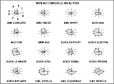
The star plot is a method of displaying multivariate data. Each star represents a single observation. Typically, star plots are generated in a multi-plot format with many stars on each page and each star representing one observation.
Star plots are used to examine the relative values for a single data point (e.g., point 3 is large for variables 2 and 4, small for variables 1, 3, 5, and 6) and to locate similar points or dissimilar points.
In diagram: The plot abve contains the star plots of 16 cars. The data file actually contains 74 cars, but we restrict the plot to what can reasonably be shown on one page. The variable list for the sample star plot is 1=Price, 2=Mileage (MPG), 3=1978 Repair Record (1 = Worst, 5 = Best), 4= 1977 Repair Record (1 = Worst, 5 = Best), 5=Headroom, 6= Rear Seat Room, 7=Trunk Space, 8= weight, and 9= Length
No comments:
Post a Comment